Convert Trapped Tables within PDFs as Pandas DataFrames

pandas Nov 30, 2022
Continue Reading...

Use the Pandas String-Only get_dummies Method to Instantly Restructure your Data

pandas Oct 24, 2022
Continue Reading...

Use this One Line of Code to Create Beautiful Data Visualizations in Python

data visualization Oct 04, 2022
 

In this post, you'll learn the absolute quickest path to create beautiful data visualizations in Python. Specifically, we will be issuing a command from Seaborn, a popular library for creating static two-dimensional plots. We begin by reading in some data from Airbnb listings in Washington D.C.

In [1]:
import pandas as pd df = pd.read_csv('../../data/airbnb.csv', usecols=['neighborhood', 'accommodates', 'price']) df.head() 
Out[1]:
  neighborhood ...
Continue Reading...

Displaying Pandas DataFrames Horizontally in Jupyter Notebooks

pandas Jun 23, 2022

In this tutorial, you’ll learn how to display pandas DataFrames horizontally in your Jupyter Notebooks. I find this useful when presenting data to an audience or when delivering tutorials like this one.

Default DataFrame Display

Let’s begin by reading in three different DataFrames, assigning them to variable names. By default, nothing is displayed in the output when an assignment statement is the last line of a notebook cell.

import pandas as pd
bikes = pd.read_csv('bikes.csv',...
Continue Reading...

Build an Interactive Data Analytics Dashboard with Python - A Comprehensive Course

data visualization Jun 23, 2022

I’m excited to announce the launch of Build an Interactive Data Analytics Dashboard with Python, a comprehensive course that teaches you every step to launch your very own dashboards with Python.

Specifically, you will be building a Coronavirus Forecasting Dashboard (available at https://coronavirus-project.dunderdata.com/) that shows historical and predicted values for deaths and cases for all countries in the world and US states from the ongoing coronavirus pandemic. The final...

Continue Reading...

Top 5 Reasons to Use Seaborn for Data Visualizations

data visualization Jun 23, 2022

The Seaborn data visualization library in Python provides a simple and intuitive interface for making beautiful plots directly from a Pandas DataFrame. When users arrange their data in tidy form, the Seaborn plotting functions perform the heavy lifting by grouping, splitting, aggregating, and plotting data, often with a single line of code. In this article, I will provide my top five reasons for using the Seaborn library to create data visualizations with Python.

Reason # 1 —...

Continue Reading...

Awesome Pandas Tricks — Advent of Code Problems 1–5

pandas Jun 23, 2022

I have a new tutorial where I show interesting, unusual and just plain awesome ways to use the pandas library to solve data problems. Pandas is such a versatile library with so many ways to solve so many different problems.

The Advent of Code is a series of 25 fun problems released every December 1st, each containing some kind of data that require some sort of computing power to solve. While pandas is probably not the goto choice for these challenges, it is absolutely has the ability to solve...

Continue Reading...

How to become an Expert at Pandas for Data Analysis for FREE

data science pandas python Jun 21, 2022

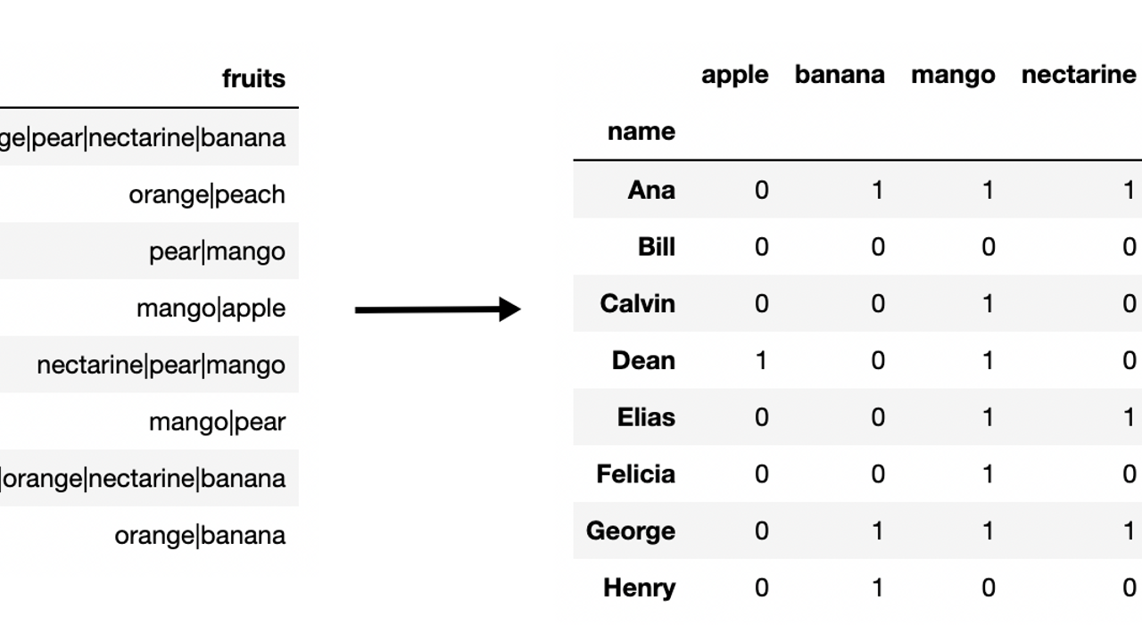
In 2014, I was first introduced to pandas and had no idea how to use it. By 2017, I had written the 500 page book Pandas Cookbook. This is roughly the path I took to mastering pandas for free:

  1. Read the official documentation
  2. Practice examples in the documentation
  3. Flashcards
  4. Share a full data analysis with others
  5. Answer old Stack Overflow Questions
  6. Answer new Stack Overflow Questions
  7. Teach others in-person or online
  8. Write pandas blog posts
  9. Repeat

Read the official documentation

The...

Continue Reading...

Why Matplotlib Figure Inches Don't Match Your Screen Inches and How to Fix it

matplotlib Dec 09, 2021
 

Why Matplotlib Figure Inches Don't Match Your Screen Inches and How to Fix it

If you've worked with the matplotlib data visualization library before, then you'll be familiar with the term figsize, which is measured in figure inches. These default to 6.4 inches in width by 4.8 inches in height. But, if you actually measured the physical screen inches on your monitor, you're likely to get different numbers. This post details why this mismatch exists and how to change the...

Continue Reading...

Automatically Wrap Graph Labels in Matplotlib and Seaborn

data visualization Dec 07, 2021

If you’ve used matplotlib and seaborn to create data visualizations enough, then you’ve probably run into the issue of overlapping text labels on the x-axis.

Let’s take a look at an example that uses Airbnb listings data.

import pandas as pd
import matplotlib.pyplot as plt
import seaborn as sns

cols = ['neighborhood', 'accommodates', 'price']
airbnb = pd.read_csv('data/airbnb.csv', usecols=cols)
airbnb.head()
png

After setting the theme, we create a bar plot of the mean price...

Continue Reading...
1 2 3 4 5
Close

Register for a free account

Upon registration, you'll get access to the following free courses:

  • Python Installation
  • Intro to Jupyter Notebooks
  • Intro to Pandas
  • Python  and Pandas Challenges