
Build an Interactive Data Analytics Dashboard with Python - A Comprehensive Course
I’m excited to announce the launch of Build an Interactive Data Analytics Dashboard with Python, a comprehensive course that teaches you every step to launch your very own dashboards with Python.
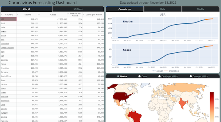
Specifically, you will be building a Coronavirus Forecasting Dashboard (available at https://coronavirus-project.dunderdata.com/) that shows historical and predicted values for deaths and cases for all countries in the world and US states from the ongoing coronavirus pandemic. The final product will be a live dashboard, automatically updated daily, hosted on a remote server for anyone, anywhere in the world to see!
You will learn and complete the entire process for building the dashboard including the following topics:
- Getting, Cleaning, and Transforming the Data — You will learn how to collect the data, find and clean bad data, and transform it so that it can be used for building models capable of prediction.
- Data Smoothing — You will learn several different techniques such as LOWESS to smooth the jagged raw data so that the model can better detect trends.
- Exponential Growth and Decline Models — You will begin modeling coronavirus cases for each area of the world with these simple models that can capture a single exponential growth or decline phase, but not both.
- Logistic Growth Models — You will learn about a separate class of “S-Curve” models capable of capturing both exponential growth and decline in the same model.
- Modeling New Waves — Coronavirus cases appear in waves over different time periods. You will learn how to change your model so that it can detect any number of new waves in the future.
- Encapsulation into Classes — After selecting your model, you will encapsulate all of the code together into Python classes, eventually to be used in your final production code.
- Visualizations with Plotly — You will learn how to use the Plotly Python library to create interactive data visualizations targeted for the web
- HTML and CSS — You are building a web application and will learn the fundamentals of HTML and CSS to help add customization with the help of Dash.
- Building the Dashboard with Dash — You will learn how to build all of the components and interactivity of the dashboard with the Dash Python library.
- Deployment — One of the most exciting parts of a project is deploying it on your own server for the world to see. You will learn two different deployment options — one simple and the other more complex, but with more flexibility.
What’s Included?
This course comes with a massive amount of material including:
- 13 Jupyter Notebooks
- 26 Exercises with detailed solutions
- 200 page PDF of the entire course content
- All production code for the dashboard
- 12 hours of video tutorials
Start building the dashboard today!
I believe this is a really fun and exciting course that covers a wide range of topics and provides you with all the tools to launch your own dashboard, on your own server for the world to see. Purchase the course here to get to start building the dashboard today.

Master Data Analysis with Python
Become an expert at using pandas to do data analysis with the comprehensive book Master Data Analysis with Python containing 500+ exercises and projects.
Recent Posts