
Use this One Line of Code to Create Beautiful Data Visualizations in Python

In this post, you'll learn the absolute quickest path to create beautiful data visualizations in Python. Specifically, we will be issuing a command from Seaborn, a popular library for creating static two-dimensional plots. We begin by reading in some data from Airbnb listings in Washington D.C.
import pandas as pd df = pd.read_csv('../../data/airbnb.csv', usecols=['neighborhood', 'accommodates', 'price']) df.head() Build an Interactive Data Analytics Dashboard with Python - A Comprehensive Course
I’m excited to announce the launch of Build an Interactive Data Analytics Dashboard with Python, a comprehensive course that teaches you every step to launch your very own dashboards with Python.
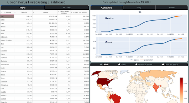
Specifically, you will be building a Coronavirus Forecasting Dashboard (available at https://coronavirus-project.dunderdata.com/) that shows historical and predicted values for deaths and cases for all countries in the world and US states from the ongoing coronavirus pandemic. The final...
Top 5 Reasons to Use Seaborn for Data Visualizations

The Seaborn data visualization library in Python provides a simple and intuitive interface for making beautiful plots directly from a Pandas DataFrame. When users arrange their data in tidy form, the Seaborn plotting functions perform the heavy lifting by grouping, splitting, aggregating, and plotting data, often with a single line of code. In this article, I will provide my top five reasons for using the Seaborn library to create data visualizations with Python.
Reason # 1 —...
Automatically Wrap Graph Labels in Matplotlib and Seaborn
If you’ve used matplotlib and seaborn to create data visualizations enough, then you’ve probably run into the issue of overlapping text labels on the x-axis.
Let’s take a look at an example that uses Airbnb listings data.
import pandas as pd
import matplotlib.pyplot as plt
import seaborn as sns

cols = ['neighborhood', 'accommodates', 'price']
airbnb = pd.read_csv('data/airbnb.csv', usecols=cols)
airbnb.head() 
After setting the theme, we create a bar plot of the mean price...
Instantly Beautify Matplotlib Plots by Viewing all Available Styles

In this post, you'll learn about the different available matplotlib styles that can instantly change the appearance of the plot. Let's begin by making a simple line plot using the default style. This simple style is often the first (and sometimes only) style that many people encounter with matplotlib not realizing how easy it is to choose others.
import matplotlib.pyplot as plt import numpy as np x = np.arange(-2, 8, .1) y = .1 * x ** 3 - x ** 2 + 3 * x + 2 fig, ax...Official Release of bar_chart_race - A Python Package for Creating Animated Bar Chart Races
I'm excited to announce the official release of bar_chart_race, a python package for creating bar chart races. In this post, I'll cover many of the major available options. Navigate to the official documentation for a full breakdown of all of the options.
Motivation
Bar chart races have become very popular over the last year and no python package existed to create them. I also built some for my coronavirus dashboard.
Installation
Install with:
pip install...
Master Data Analysis with Python
Become an expert at using pandas to do data analysis with the comprehensive book Master Data Analysis with Python containing 500+ exercises and projects.
Recent Posts